HP ranks among the most well-known logos within the technology sector. HP refers to Hewlett-Packard and is an established and trusted technology brand that has developed its logo design over several decades. The HP logo alone signifies reliability and trustworthiness to millions of customers worldwide, who buy everything from computers and laptops to printers and accessories.
In this comprehensive guide to the HP logo, you will discover everything you need to know about the logo, its meaning, logo history, logo redesigns, and how it became one of the largest visual identities within technology. If you are a designer, a branding fan or simply a fan of HP, you will come away with a better understanding of the HP logo and its place in branding today.
What is The HP Logo Mean?

HP is short for Hewlett-Packard, which is taken from the last names of company founders Bill Hewlett and Dave Packard. HP was founded in 1939, in a garage in Palo Alto, California, which today is thought of as the home of Silicon Valley.
The minimalist circular design and sleek letters “hp” inside the circle represent:
- Innovation – HP is dedicated to technology.
- Simplicity – the design and philosophy of a user-friendly approach to their products.
- Trust – the mark of reliability recognized by consumers and businesses worldwide.
The HP logo is not just an emblem — it’s a promise of performance, precision, and progress.
History and Evolution of the HP Logo
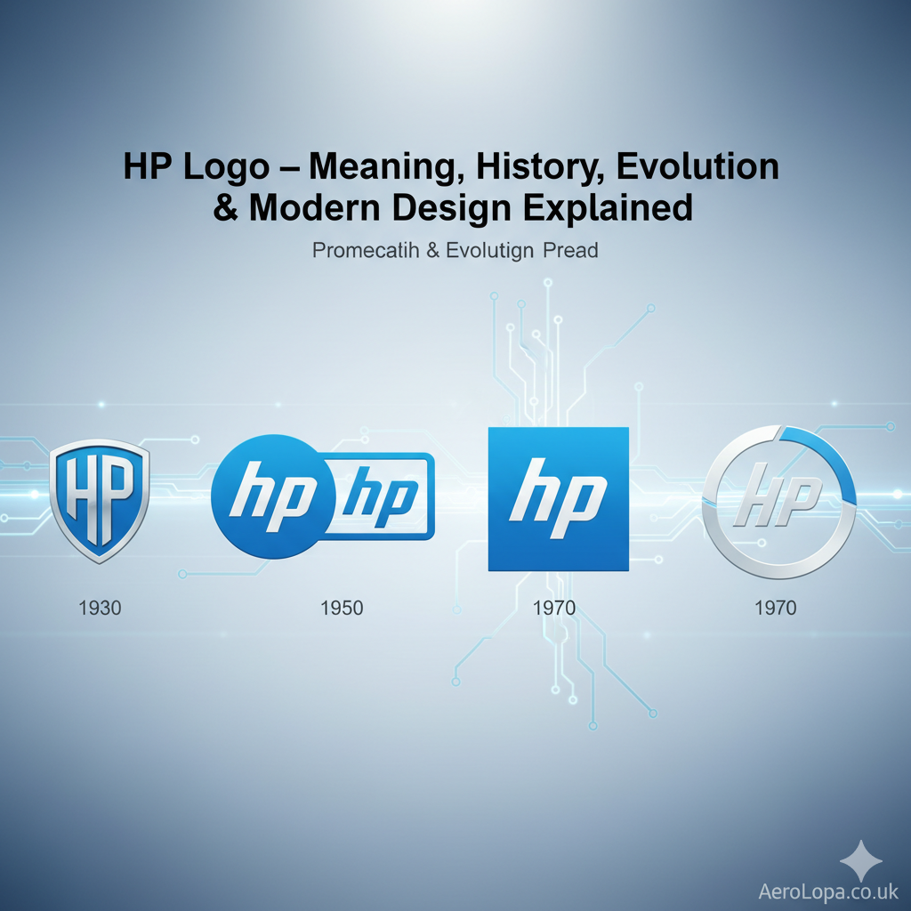
HP’s logo has delighted audiences all around the globe, with a few variations over the years, while still aligning with current design trends, adapting to meet the market’s unexpected changes over time. Let’s explore the logos over the past seven decades.
1. The Original Logo (1939–1954)
The original HP logo was simply the full names of the founders “Hewlett-Packard” in a cursive typeface font. The words depicted the engineering spirit of the early years, more focused on an emphasis on technical precision.
2. The Classic Circle Logo (1954–1979)
HP introduced the now-famous “hp” circle logo in 1954. The lowercase letters “hp” inside a simple circle gave the brand a timeless, minimalistic appeal. This version became the foundation for all future designs.
3. The Refined Blue Logo (1981–2011)
HP adopted a solid blue-and-white color scheme, symbolizing trust and innovation. The blue tone was chosen for its calming and professional appeal — perfect for a company leading the digital revolution.
4. The Modern Slim Design (2011–Present)
The current HP logo is sleek, geometric, and optimized for digital use. It features clean lines, maintaining the classic circular design while appearing more modern and futuristic. This redesign aligns with HP’s focus on modern technology, sustainability, and innovation.
The Symbolism Behind the HP Logo
The HP logo’s simplicity hides deep meaning:
- Circle Shape: Represents unity, connection, and global reach.
- Lowercase Letters: Give the logo a friendly and approachable feel.
- Blue Color: Symbolizes reliability, professionalism, and trust.
- Minimalist Design: Reflects HP’s focus on efficiency and innovation.
Every element of the logo is designed to communicate the brand’s personality — dependable, advanced, and future-focused.
HP Logo PNG – Where to Find and How to Use
If you’re looking for the HP logo PNG for presentations, designs, or branding purposes, it’s essential to use official, high-resolution versions only. These can be found on:
- HP’s official press and brand media page.
- Authorized technology media kits.
- Corporate branding libraries.
The HP logo PNG format supports transparent backgrounds, making it easy to use on any digital surface without visual distortion.
HP Logo Sticker for Laptop
HP enthusiasts and laptop owners often personalize their devices with HP logo stickers. These stickers come in:
- Metallic finishes for a sleek, professional look.
- Transparent backgrounds for minimalism.
- LED-cut stickers that glow under light for a futuristic touch.
When purchasing HP logo stickers for laptops, ensure you buy from verified sellers or HP’s official merchandise store to avoid counterfeit products.
HP Petrol Logo and HP Gas Logo – Not the Same!
It’s important to clarify that HP logo for Hewlett-Packard (HP Inc.) is different from the HP petrol logo and HP gas logo used by Hindustan Petroleum, a major Indian oil and gas company.
Here’s how they differ:
| Feature | Hewlett-Packard (HP) | Hindustan Petroleum (HPCL) |
|---|---|---|
| Industry | Technology | Petroleum & Gas |
| Symbol | “hp” inside a blue circle | “HP” with red & blue flame icon |
| Usage | Computers, printers, laptops | Petrol pumps, gas stations |
| Color Scheme | Blue & white | Red, blue, and white |
So if you come across HP petrol pump logo PNG, remember it belongs to HPCL (Hindustan Petroleum) — not Hewlett-Packard.
HP New Logo – The Future of Minimalism
In 2016, HP unveiled its new experimental logo, designed by Moving Brands. The HP new logo is ultra-minimalist, consisting of just four diagonal strokes that subtly suggest the letters “hp.”
While it’s not yet the official logo across all HP products, the HP new logo has appeared on some premium devices like the HP Spectre laptop series.
This design represents HP’s vision for the future: bold, simple, and elegantly futuristic.
How to Add HP Logo in Windows 10
If you want to add the HP logo in Windows 10, for personalization or branding, here’s how:
- Download a transparent HP logo PNG from HP’s official media page.
- Right-click your desktop → choose Personalize → select Background.
- Set the image as wallpaper or lock screen.
- For a custom boot logo (advanced users):
- Access BIOS settings (F10 during startup).
- Some HP devices allow changing the startup splash screen logo under “Boot Options.”
Be careful not to use unverified tools or third-party software that might damage your BIOS configuration.
HP Logo for Branding and Business
HP’s consistent branding success teaches valuable lessons in business identity:
- Consistency builds trust: The HP logo rarely changes drastically, maintaining familiarity.
- Minimalism works: A clean design lasts longer than flashy trends.
- Color psychology matters: Blue evokes stability and confidence, essential for tech brands.
- Digital adaptability: The logo looks equally stunning on hardware, packaging, or digital screens.
Whether you’re designing your own brand logo or studying HP’s strategy, these insights are invaluable.
Fun Facts About the HP Logo
- HP’s founders flipped a coin to decide whose name would come first — that’s why it’s Hewlett-Packard, not Packard-Hewlett.
- The HP logo has remained lowercase since the 1950s, emphasizing simplicity.
- HP’s design team has always prioritized symmetry and geometry for better legibility.
- The HP garage where it all began is now a historical landmark in California.
- The HP logo is recognized in over 170 countries worldwide.
Download HP Logo PNG and Variations
If you’re a designer or a tech enthusiast, here are the commonly used versions:
- HP logo PNG (Transparent Background) – for websites, videos, or presentations.
- HP logo vector (SVG, EPS) – for high-quality printing.
- HP petrol pump logo PNG – for Hindustan Petroleum branding.
- HP gas logo – for official HPCL gas distribution graphics.
Always use licensed and verified sources to ensure copyright compliance.
FAQs About the HP Logo

When did HP change their logo?
HP’s logo has evolved multiple times, but the most recent significant redesign came in 2011, modernizing the circular blue logo for digital use. The minimalist four-stroke HP logo was introduced experimentally in 2016 for select premium devices.
How to add HP logo in Windows 10?
Download a transparent HP logo PNG, go to your desktop personalization settings, and set it as your wallpaper or startup background. Advanced users can change the boot splash screen from BIOS on supported HP models.
Is HP and Hindustan Petroleum the same company?
No. Hewlett-Packard (HP Inc.) is a technology company, while Hindustan Petroleum (HPCL) operates in the oil and gas industry. They are completely unrelated.
Where can I download the HP logo PNG legally?
You can download it from the official HP brand website or authorized media resources. Avoid third-party logo sites to prevent copyright issues.
What font is used in the HP logo?
HP’s logo uses a custom-designed geometric sans-serif typeface, optimized for digital clarity and balance.
What is the color code of the HP logo?
The official HP blue color is #0096D6, representing trust, technology, and professionalism.
What does the HP new logo mean?
The new logo’s four strokes symbolize minimalism, modernity, and HP’s move toward futuristic design language.
Conclusion
The HP logo is more than a brand mark — it’s a tale of its drive for innovation, reliability, and its evolution of design. Since its humble beginnings in a garage, HP has created a brand that stands for trust and innovation in technology.
Downloading a new HP logo PNG, customizing your HP device, or researching the HP new logo concept, having an understanding of its history adds an appreciation for the craft of branding and design consistency.
HP still leads the way — it still shows that simple, visionary, and genuine will never go out of style.

